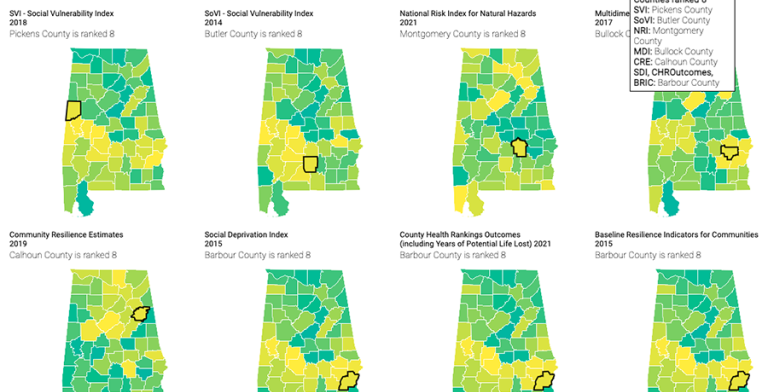
This project compares data for 8 national indices, as well as the census measures that go into 15 additional indices to provide an overview of how indices are made, by whom, and for what purpose.
What is an index?
This project compares data for 8 national indices, as well as the census measures that go into 15 additional indices to provide an overview of how indices are made, by whom, and for what purpose.
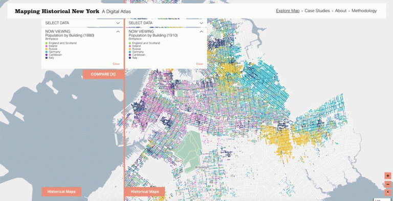
Announcing the official launch of Mapping Historical New York: A Digital Atlas.
The interactive map visualizes Manhattan’s and Brooklyn’s transformations during the late-nineteenth and early-twentieth centuries. Drawing on 1850, 1880, and 1910 census data, it shows how migration, residential, and occupational patterns shaped the city.
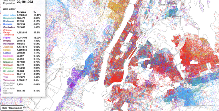
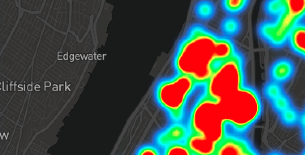
The Asian American Dot Density map represents each Asian American as 1 dot color coded by 21 different racial groups found in Census data. The map reveals the complex spatial dynamics of specific asian racial groups in places across the country.
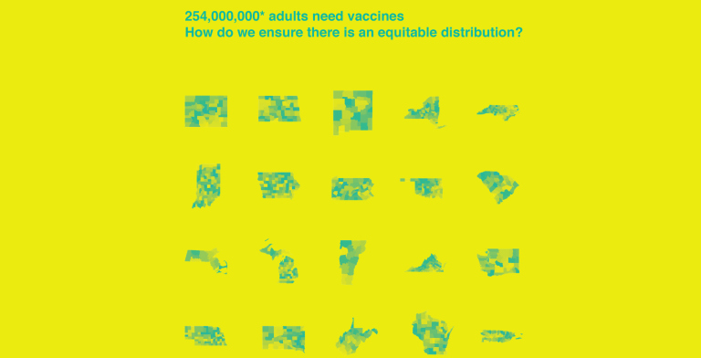
An interactive map of each county in each state proposing how COVID-19 vaccinations could be distributed is now publicly available, providing an important tool for policymakers and the public alike to analyze the differences between multiple distribution strategies as well as issues surrounding equity and vulnerability of at-risk groups.
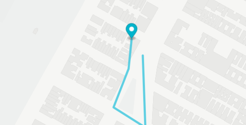
In this tutorial, we will use the sensing capacity of our devices to make GPS drawings, an activity with a rich precedent including You Are Here by CSR's Laura Kurgan, Amsterdam Realtime by Esther Polak and Jeroen Kee, and drawings by Jeremy Wood. Contemporary devices and Mapbox's API make it straightforward for us to get similar results to what was technically very challenging at the time these works were made.
In the previous tutorial, we created markers using Mapbox GL JS by declaring them explicitly in our code. Our basemap data came from Mapbox's defaults, which in turn come from OpenStreetMap. In this tutorial, we will create a tileset using external data. Just like QGIS, Mapbox can add layers from vector, raster, and point-based information. Unlike QGIS, which works with maps at a single level of detail, Mapbox converts data to tiles which are delivered to the browser as they are needed. The data in each tile is limited to a bounded geographic area and zoom level, the result of which is that certain things can be visualized only at relevant times, rather than everything needing to be visualized all at once. This allows for the kind of interactivity we have come to expect from web maps, and it also allows us to make local calculations about the user's position in relation to data. The theme of this tutorial will be a classic element of NYC life.
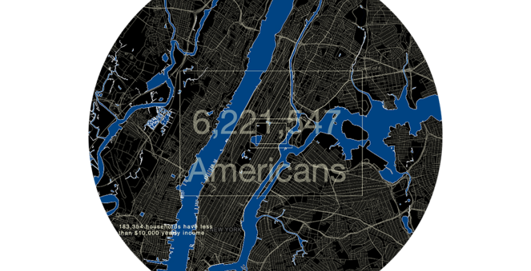
Powers of Ten: Census Edition and Cross-sections Map for New York City are on view at the Museum of the City of New York. Both maps aim to change the interfaces designed for Census data by using physical scale and experiences as orienting concepts for visualizing the contents of the Census. These two digital maps designed by Mellon Associate Research Scholar, Jia Zhang, are being exhibited as part of "Who We Are," from November 22, 2019-September 20, 2020.

The Center for Spatial Research is seeking Columbia student candidates for both full-time and part-time positions during Summer 2018. Students will be responsible for data analysis, visualization, map design, and research on projects dealing with our current research focus: conflict urbanism. Students will work extensively with spatial data including mining and analyzing data, processing and collecting data, and/or visualizing data in compelling and innovative ways.

The Center for Spatial Research is pleased to announce a call for applications for a full-time Associate Research Scholar position for the 2018-2019 academic year. The position, within the Center for Spatial Research (CSR) will focus on critical work with Geographic Information Systems and design for a new grant-funded project mapping historical New York.

The Center for Spatial Research is pleased to announce a new $1 million grant received from the Robert David Lion Gardiner Foundation to create web-based, interactive maps of Manhattan and Brooklyn during the late 19th and early 20th centuries. The three-year project is a collaboration of Columbia’s History Department and the Columbia Center for Spatial Research in the Graduate School of Architecture, Planning and Preservation (GSAPP).