Interactive Vaccine Allocation Map Launches as Update to Mapping the New Politics of Care
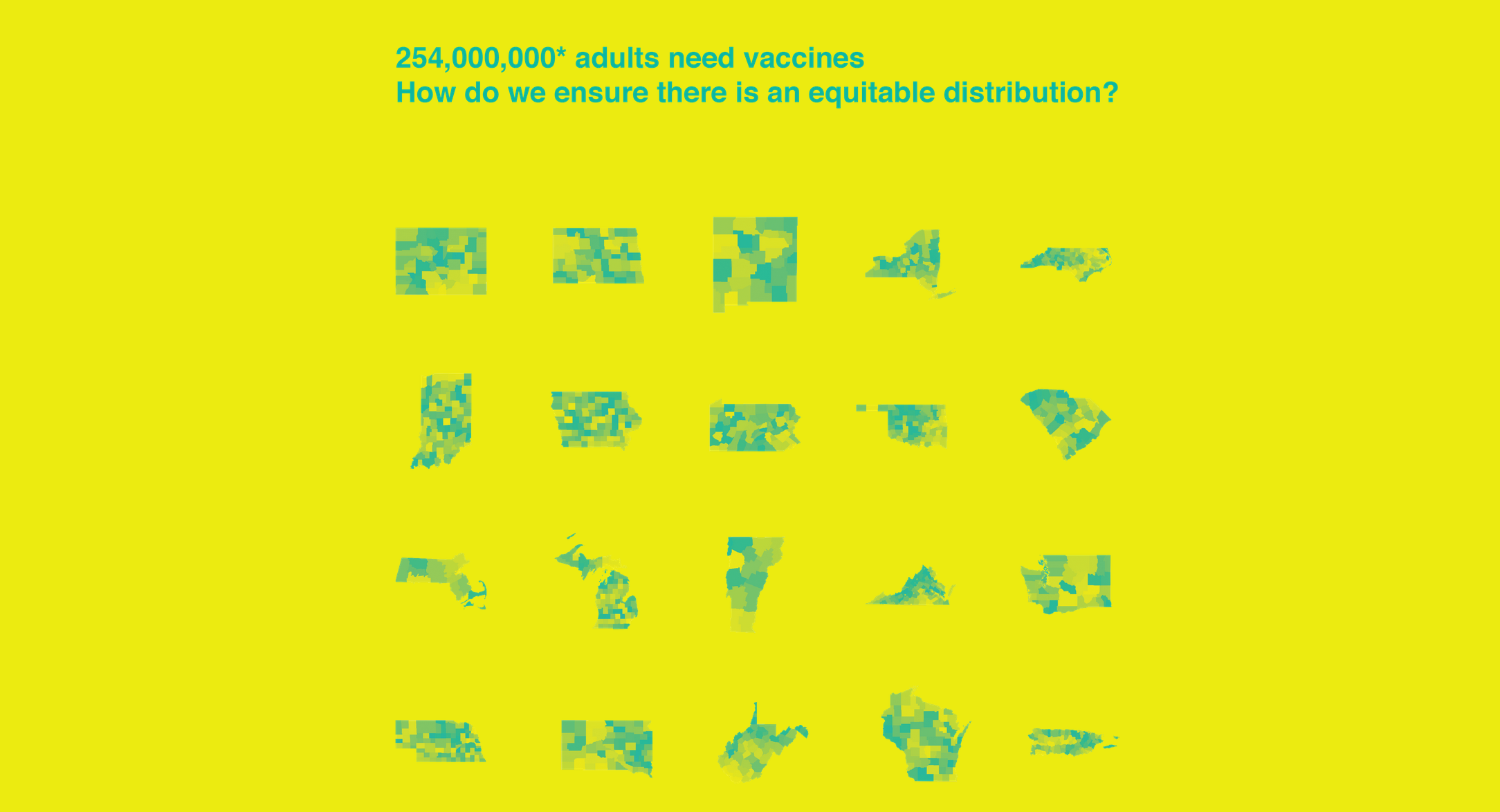
An interactive map of each county in each state proposing how COVID-19 vaccinations could be distributed is now publicly available, providing an important tool for policymakers and the public alike to analyze the differences between multiple distribution strategies as well as issues surrounding equity and vulnerability of at-risk groups.
The map was created by the Center for Spatial Research (CSR) at Columbia University’s Graduate School of Architecture, Planning and Preservation (GSAPP) and the Yale Global Health Justice Partnership (GHJP) of the Yale Law School and Yale School of Public Health. It is the next phase of their collaborative project—Mapping the New Politics of Care — with this latest effort focused solely on COVID-19 vaccine allocation. “With over 250 million adults still needing vaccines across the country, who will be first in line to receive them?” said Amy Kapczynski Professor of Law at Yale Law School and faculty co-director of GHJP. “All people in the United States have been granted the right to have access to free, safe, and effective COVID-19 vaccines. This map will help make sure that this is done fairly and equitably.” In the context of limited supplies, states have enacted policies prioritizing specific groups based on reasonable — but subjective — weighing of scientific, practical, and ethical evidence and values, according to the Columbia and Yale teams. The new map shows how prioritizing different groups for vaccination shifts the terrain of vaccine allocation and impacts which communities are protected first.
The Center for Disease Control’s (CDC) Advisory Committee on Immunization Practices (ACIP) recommended that the first phase (1a) of vaccine roll-out, which began in December 2020, prioritize health care personnel and long-term care facility residents. In their guidance, ACIP explicitly cited evidence that prioritizing Phase 1a groups would mitigate health inequities due to “the disproportionate representation of racial and ethnic minority groups” amongst low-wage health care personnel and that residents in the lowest-rated long-term care facilities “are more likely to serve patients experiencing social or economic disadvantage and are more likely to have COVID-19-associated outbreaks.” However, other scientific advisory bodies, such as the National Academies of Science, Engineering and Medicine, have suggested that in addition to these specific kinds of target populations, vaccine allocation take into account the geographic disparities across the United States making these same population groups more or less vulnerable given the local social and economic conditions in place. NASEM therefore recommended that the CDC’s Social Vulnerability Index (SVI) be used to further guide vaccine distribution and many states are using this index to do just that. “The SVI is an important metric to manage, monitor and evaluate our progress towards equity in vaccine distribution,” said Laura Kurgan, professor at Columbia University’s Graduate School of Architecture, Planning and Preservation and director of the CSR. “We’re already seeing disparities in vaccination across the country with Black Americans significantly trailing in immunization, which underscores the importance of focusing on social vulnerability and in particular race and ethnicity moving forward.”
The map created by Yale and Columbia enables the comparison of four COVID-19 vaccine allocation scenarios at the county level, including: Simply allocating federal disbursements of vaccines by county adult population; Using ACIP’s Phase 1a prioritization of health care personnel and long-term care facility residents, which is what most states have tried to do thus far, then; Weighting the number of individuals in these phase 1a categories by each county’s SVI and finally; weighting these Phase 1a categories but leaving out race/ethnicity out of the 15 indicators that make up the SVI. These comparisons highlight the trade-offs of competing strategies: between each pair of maps, one can see the respective number of vaccine doses allocated to each county and therefore which populations and communities are protected first. In some cases users will see the rank ordering of which counties get more doses change with your choices as well. For example: As of January 18, 2020, Maryland had been allocated 417,925 first doses, or enough to cover approximately 9 percent of its estimated adult population of 4,677,166. Selecting Prince George’s County, a suburb of Washington, D.C. that has the second largest population in Maryland, illustrates the teams’ points about equity in allocation: If vaccines were distributed in proportion to the county’s adult population, Prince George’s would be allocated 63,051 doses (~15.1 percent of the state’s total doses). If instead vaccines were distributed in proportion to the county’s Phase 1a population, Prince George’s would be allocated just 60,494 doses (~14.5 percent of the state’s total doses). Compared to allocating by the adult population, using the Phase 1a population would decrease the county’s allotment by 2,556 doses (or -4.1 percent). If doses were distributed in proportion to the county’s Phase 1a population weighted by SVI, Prince George’s would be allocated 72,468 doses (~17.3 percent of the state’s total doses). Compared to allocating by just Phase 1a population, adding SVI as a weight would increase the county’s allotment by 11,974 doses (or 19.8 percent). If a modified SVI measure that excludes race and/or ethnicity is used to weight the Phase 1a population then Prince George’s would be allotted only 61,830 doses (~14.8 percent of the state’s total doses). Compared to Phase 1a weighted by SVI, excluding the race and or ethnicity factor would decrease the county’s allotment by 10,638 doses (or 14.7 percent) due to Prince George’s larger proportion of non-white non-Hispanic people — and returns its allocation to a level comparable with Phase 1a population alone (60,494 doses). The map illustrates that no scenario is neutral. Each prioritization reflects an explicit or implicit valuation, as well as the logistical challenges of distributing vaccine doses to hundreds of millions of Americans as quickly as possible. The project visualizes the differences and trade-offs between each of these choices in the hopes that a more nuanced understanding of the options will lead to more informed and ethical outcomes, according to those involved. “We don’t have to use the SVI to make vaccine allocation decisions directly, but understanding who is likely to be left behind might enable states to make targeted investments in outreach, distribution facilities, and health care capacity in order to mitigate the impact of existing inequality,” said Gregg Gonsalves, Assistant Professor at the Yale School of Public Health and Associate Professor (Adjunct) of Law and GHJP’s faculty co-director. The map only shows vaccine allocations under Phase 1a, as collecting data on health care workers and residents of long-term care facility residents at a county level was possible with these groups. The next phase, 1b, includes a broader, diverse category of frontline essential workers — including numerous kinds of professions — as well as individuals over 75 years of age, which makes it harder to develop estimates of the size of these new populations, according to the researchers. “We also would have liked to pin our own estimates in these scenarios to actual vaccine allocations by county but this data is not available nationwide,” said Dare Brawley, assistant director of the CSR. “Even now it’s clear that disparities are arising across the country, with white Americans two to three times more likely to have been vaccinated than their Black American counterparts, which shows our concerns about equity and vulnerability have not been misplaced.” The Mapping the New Politics of Care project team consists of Laura Kurgan, Dare Brawley, Jia Zhang of the CSR (all bios here) and Gregg Gonsalves, Suzan Iloglu and Tommy Thornhill of the GHJP and Yale School of Public Health and David Herman of the GHJP and Yale Law School.
The Center for Spatial Research was established in 2015 as a hub for urban research that links design, architecture, urbanism, the humanities and data science. It sponsors research and curricular activities built around new technologies of mapping, data visualization, data collection, and data analysis. CSR focuses on data literacy as well as interrogating the world of “big data,” working to open up new areas of research and inquiry with advanced design tools to help scholars, students as well as our collaborators and audiences, to understand urbanization worldwide –– past present and future.
The Global Health Justice Partnership was established in 2012 to promote interdisciplinary, innovative, and effective responses to global health disparities. It is a transformative collaboration that integrates different fields in order to make critical policy interventions. Building on Yale’s institutional assets, the GHJP trains students in law, public health, global affairs, and other fields to undertake collaborative, real-world research and advocacy to promote health justice. It also organizes pathbreaking conferences and events, builds partnerships with local NGOs around the world to move research into action, and nurtures a truly interdisciplinary brain trust dedicated to effecting social change.